2.1 Twistlock Overview
Twistlock was founded in December 2015. It was the first container cybersecurity platform. The company was acquired by Palo Alto Networks in July 2019 for almost half a billion dollars. This case study focuses on the Cloud Serverless Radar.
2.2 Case Study Overview
The serverless architecture was created as a way to allow developers to focus on the application layer, without having to be concerned with the servers or runtimes underneath. It continues to become an increasingly popular option for cloud workloads. This radar is focused primarily on ingress and egress to other cloud platform services.
2.3 Problem Statement
In order to help users understand the big picture, we continued to develop radar visualization. Serverless technology facilitates faster development, but the lack of visibility into the underlying infrastructure means that security has taken a back seat. This radar goal is to fill this gap by providing security and visibility to protect serverless functions.
2.4 Users & Roles
Users can be divided into two types. DevOps and SecOps. SecOps typically receives alerts about a specific vulnerability, checks it on the radar, has visibility for a specific node, and then asks DevOps to fix it.
2.5 UX Research
Initially, I conducted a competitive analysis, followed by a survey of our 10 CSMs (at the time). Each CSM handled at least 30 clients. The result was actually input from 300 clients at that time. A detailed interview was then conducted with the CSMs. Twistlock's PM and R&D teams were then presented with the results. As mentioned in the Container Radar case study, the company had a policy not to speak directly to users other than customer success managers (CSMs).
2.6 Scope & Constraints
We were a three-person team. VP Product, front-end engineer, and I. This was part of a 3-month release we had. Since then, we have continued to improve it.
2.7 Outcomes & Lessons
The SecOps loved the radar. We learned from the research that DevOps teams are not interested in this visualization. They prefer using data tables. The Twistlock product was changed. Four different radars were now available. A revolution had begun.
Wireframe 1 – General view
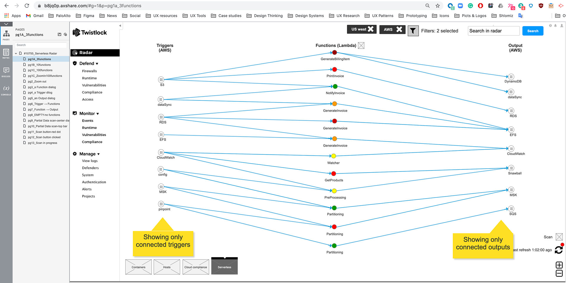
Wireframes were created using Axure. Discussions included DEVs, PMs, and me. It was our main objective to visualize all services that could trigger Functions. The flow had three main steps: Triggers, Functions, and Services (Output). We decided ultimately to have 3 columns. It has Triggers on the left, Functions in the middle, and Services. Support only Lambda (AWS), color code Lambdas based on vulnerability status, and filter by account and region.
Wireframes were created using Axure. Discussions included DEVs, PMs, and me. It was our main objective to visualize all services that could trigger Functions. The flow had three main steps: Triggers, Functions, and Services (Output). We decided ultimately to have 3 columns. It has Triggers on the left, Functions in the middle, and Services. Support only Lambda (AWS), color code Lambdas based on vulnerability status, and filter by account and region.
Wireframe 2 – Zoom in
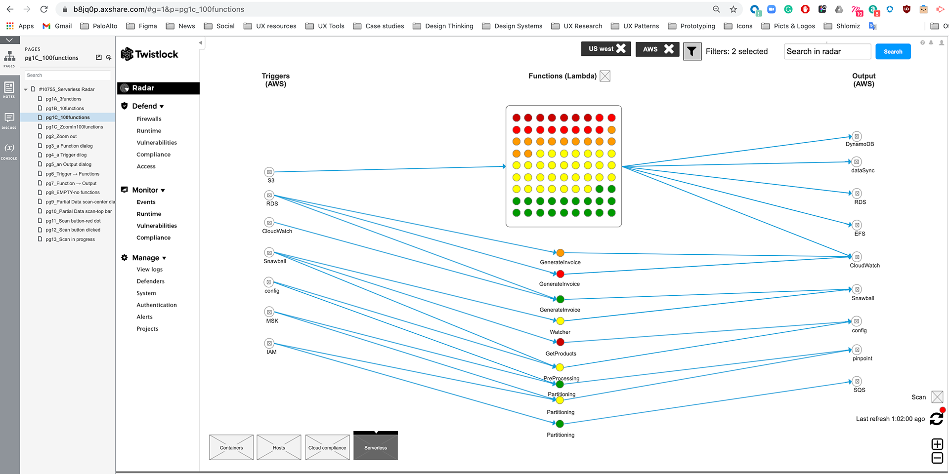
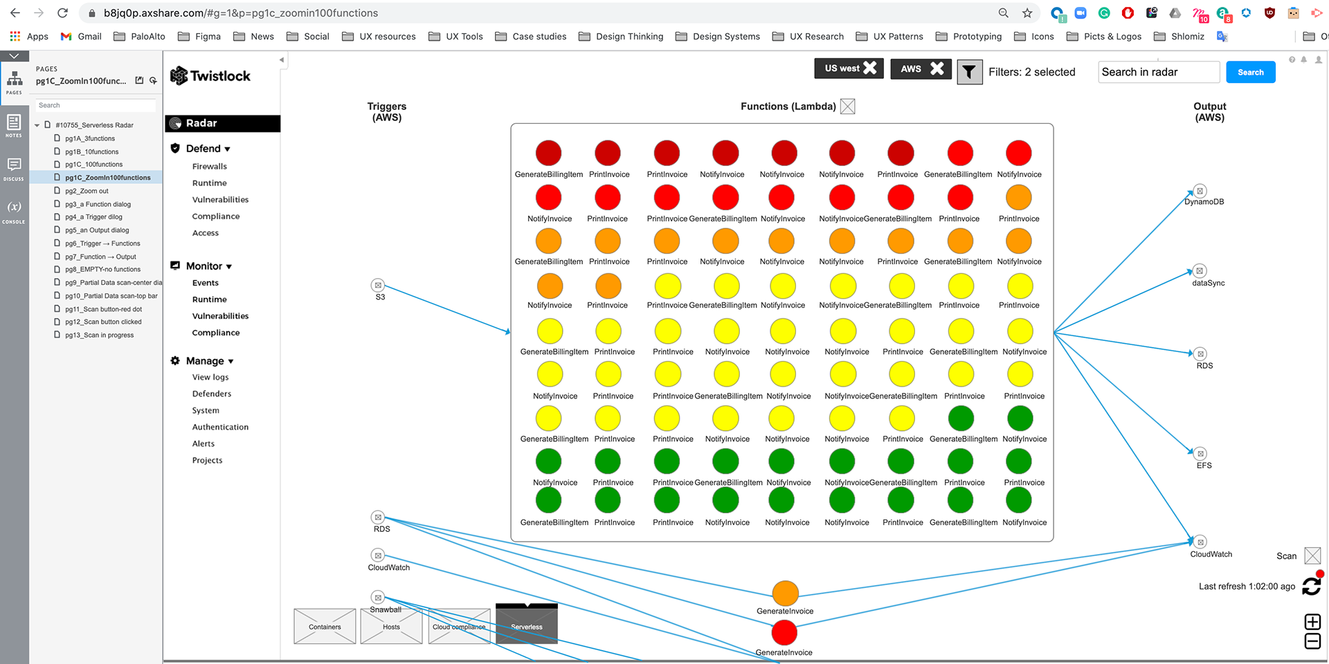
The challenge was to create value for the user, mainly for security teams (SecOps). The radar allows you to zoom in / zoom out. Nodes are color-coded based on the highest severity vulnerability or compliance issue they contain and reflect the currently defined vulnerability and compliance policies. Color coding lets you quickly spot trouble areas in your deployment.
The challenge was to create value for the user, mainly for security teams (SecOps). The radar allows you to zoom in / zoom out. Nodes are color-coded based on the highest severity vulnerability or compliance issue they contain and reflect the currently defined vulnerability and compliance policies. Color coding lets you quickly spot trouble areas in your deployment.
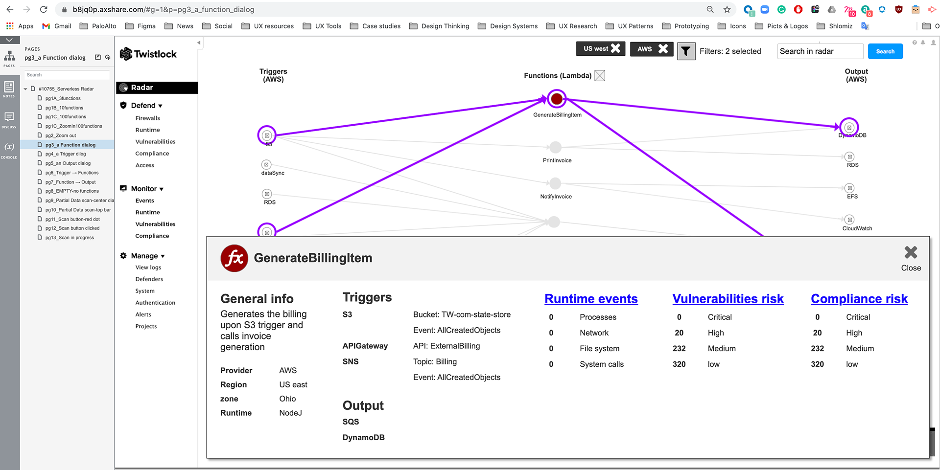
Wireframe 3 – Drill down information
Clicking on individual functions highlights their interconnects in the radar and opens a pop-up that lets you drill into the details. On click of Lambda, show popup with details on specific invocation and services it interacts with. Also on the click popup, show any relevant metadata about the function available from the underlying platform.
Clicking on individual functions highlights their interconnects in the radar and opens a pop-up that lets you drill into the details. On click of Lambda, show popup with details on specific invocation and services it interacts with. Also on the click popup, show any relevant metadata about the function available from the underlying platform.
Wireframe 4 – Color code
Maroon-one or more critical severity issues detected
Red-high severity
Orange-medium severity
Yellow-low severity
Green-no issues detected
Grey-hasn’t been configured to scan this function for vulnerability and compliance issues
Maroon-one or more critical severity issues detected
Red-high severity
Orange-medium severity
Yellow-low severity
Green-no issues detected
Grey-hasn’t been configured to scan this function for vulnerability and compliance issues

The UI (visual design)
The serverless architecture was created as a way to allow developers to focus on the application layer, without having to be concerned with the servers or runtimes underneath. It continues to become an increasingly popular option for cloud workloads
The serverless architecture was created as a way to allow developers to focus on the application layer, without having to be concerned with the servers or runtimes underneath. It continues to become an increasingly popular option for cloud workloads

Clicking on individual functions highlights their interconnects in the radar and opens a pop-up that lets you drill into the details.
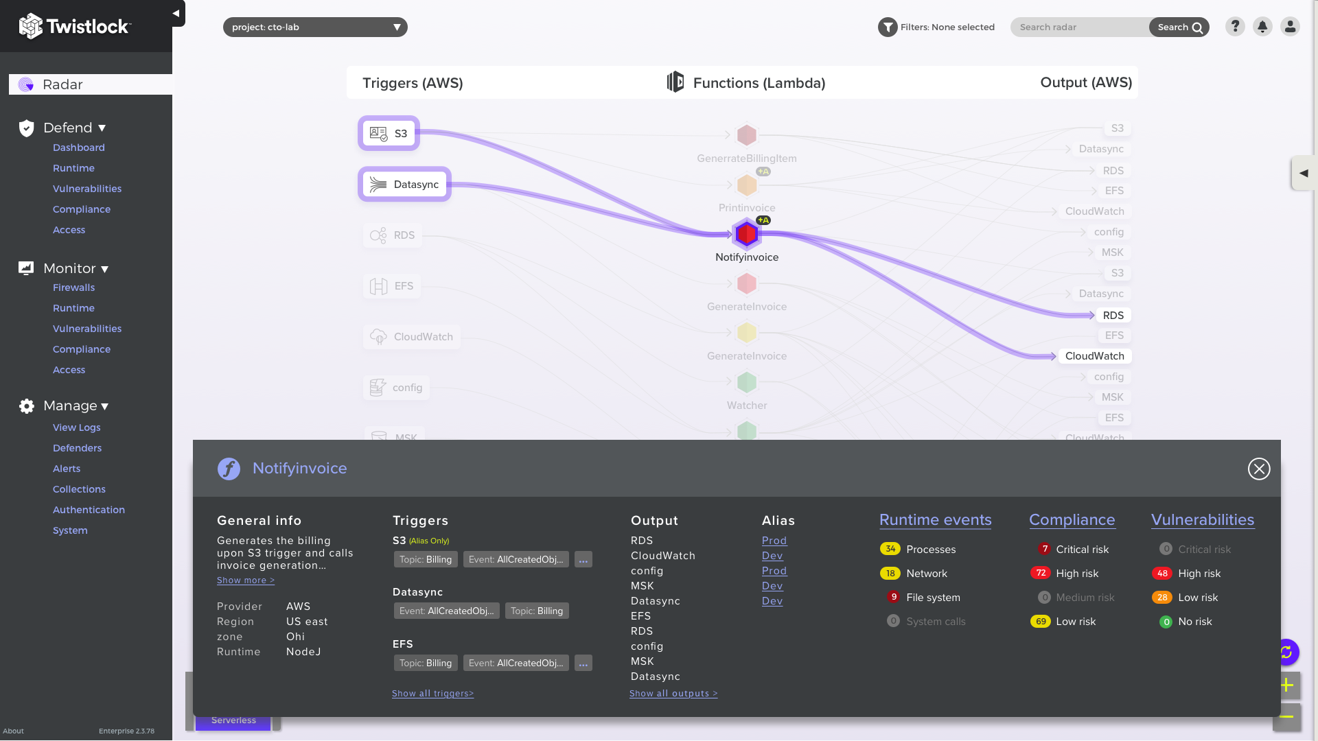
The left-most column shows how functions are invoked. The middle column shows all the functions in your environment. Functions are colored maroon, red, orange, yellow, or green to let you quickly assess their security posture. The right-most column shows the services with which each function interfaces. Lines connect triggers to functions to services, letting security teams visualize the entire connectivity flow and access rights.